Live preview, SimpleMDE editor and Perch CMS
I wrote this post a while back. The content can still be relevant but the information I've linked to may not be available.
I've been trying out SimpleMDE, which is a simple Markdown editor, in one of my local development Perch CMS sites. It doesn't have image uploading but it does have a side-by-side live preview mode that I was keen to try.
I saw the editor mentioned in the Experiments channel of the Perch Chat Slack group where Perch developer Drew MacLellan provided a download of SimpleMDE to test. I installed it on a test Perch site just like any other editor and created a different blog post type for testing it.
A new post type
My SimpleMDE blog post template is called simplemde-post.html and it lives in /perch/templates/blog/posts/. The default blog post.html template is usually in /perch/templates/blog so adding the new template to the /posts/ directory will make it available as a different post type when I add a blog post in Perch. As a result, a dropdown select menu to choose the post type will be available as the first step of writing a new blog post.
The template is different from my normal /perch/templates/blog/post.html template in only one respect. I just specify SimpleMDE as the editor for my postDescHTML textarea as follows:
<.. id="postDescHTML" type="textarea" editor="simplemde" markdown="true" size="xxl autowidth" order="5" label="Post" />
Once I have done that, I choose the SimpleMDE post type as I start writing my blog post.
Live Preview mode
There were a few problems with Live Preview mode at first because the SimpleMDE toolbar is hidden behind the Perch navigation menu and some of the styles in the preview window weren't optimal. So, I modified my Perch admin style sheet (see how to add UI and CSS customisations to Perch) as follows:
.editor-toolbar.fullscreen {z-index: 10000; margin-top: 50px}
.editor-preview-side, .CodeMirror-scroll {margin-top: 50px; padding: 1em;}
.editor-preview-side p {margin-bottom: 1.5em;}
.editor-preview-side em {font-style: italic;}
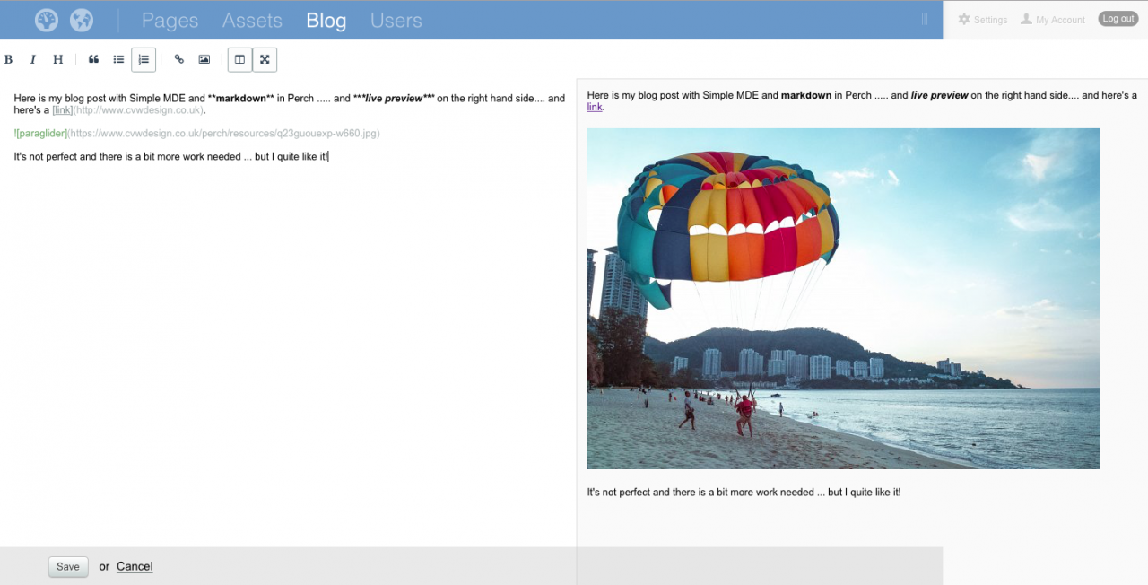
After these changes, Live Preview worked very nicely in my short test.
Here's a screenshot of it in action. My editing window is on the left and the preview window on the right.
It's by no means perfect and further work is needed. But, I think it provides another editor option that some folks will like.
As with any Live Preview mode, there are caveats. What you see in the preview window does not reflect how the post will be displayed in its entirety on the site because the layout will change on different screen sizes. Nevertheless, having a Live Preview may provide re-assurance to clients who aren't familiar with Markdown (that's most of them in my experience).
SimpleMDE is a simple editor so that would also need to be taken into account. As I mentioned, there's no image uploading as far as I can tell. Otherwise, it seemed to work well and I liked it.


Comments are OFF for this post.