Website inspiration - 28-11-10
I wrote this post a while back. The content can still be relevant but the information I've linked to may not be available.
Here are four websites that I’ve come across in my web travels which ( I think) are fantastic designs. Perhaps for different reasons but all great nonetheless.
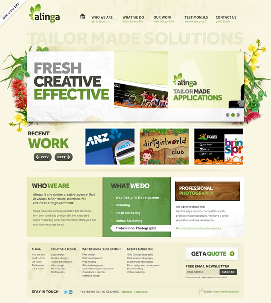
1. Alinga
The Alinga website has a great, nature-inspired, colour scheme that includes flower illustrations decorating a prominent JavaScript image slider and a pop-out navigation menu at the top. I’ve not seen this type of pop-out menu before and it’s a nice effect (it appears on hover so you’ll need to visit the website to see this).
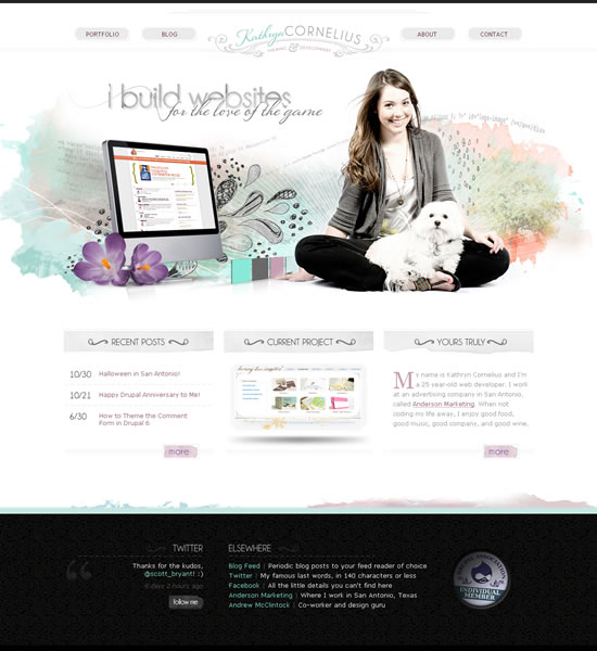
2. Kathryn Cornelius
Lovely watercolor-style illustration dominates this website for web developer Kathryn Cornelius and it’s combined with (presumably) a photo of the designer (and her dog) to give that personal touch. I also like the big footer area although it’s a bold move (I think) to make this such a dark contrast to the top of the page.
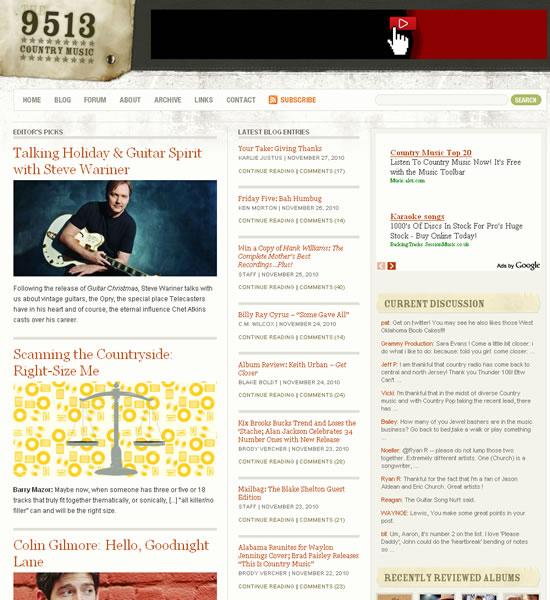
3. The 9513
The 9513 website is slightly unusual, and against the trend of centered layouts/designs, because it’s left-aligned (not visible in the screenshot). It’s a blog with a lot of content and it has a fantastically organised grid layout and typographic styles. I also like the ‘grunge’ texture behind the navigation menu; it’s a nice contrast.
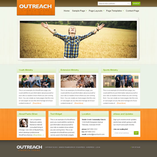
4. Outreach
I’ve ‘cheated’ on this one because it’s a WordPress theme called Outreach from StudioPress and not an actual website. However, I love the clean style of this and the orange, brown and pale green colour scheme. The interior pages of this theme are perhaps more blog-like than the others here but the home page layout works well with a main image slideshow linking to specific pages and three/four content items below.
The last word
In my opinion, these are great designs created by some incredibly talented designers. Hat tip to them.


Comments
30 Nov 2010 19:15:11
I really like these designs, thanks!
Comments are OFF for this post.