Web typography and font stacks
I wrote this post a while back. The content can still be relevant but the information I've linked to may not be available.
I have been reading more about typography on the web since I went to Skillswap Goes Typographic earlier this year. Richard Rutter has put together a good summary of the event and the slides from his and Jon Tan‘s presentations are well worth reading. Despite some advances with web fonts or font embedding and other methods for displaying and using different fonts in websites, many web designers and front-end developers stick with a core set of fonts and specify these using a font stack in their website style sheets.
For the uninitiated, a font stack is simply a list of fonts. If the user does not have the first font in the list, the browser will check if the second is available and so on. Thus, it’s perfectly possible for two users to be seeing different fonts when viewing the same website on different computers.
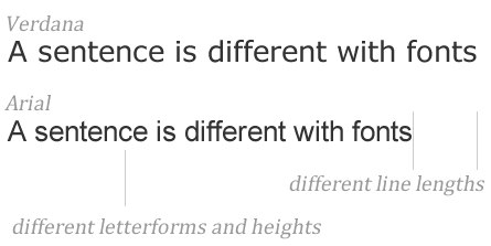
However, these font stacks are not always chosen with the care and attention that they deserve. Often, the font stack list from a programme like Dreamweaver is used when, in fact, there might be better alternatives. For example, the ‘default’ font stack “Verdana, Arial, Helvetica, sans-serif” is often chosen but the fonts Verdana and Arial have quite different characteristics and the same line of text will be much shorter in Arial and letters will appear bigger in Verdana. Not exactly a good match if that is what you were intending. In this case, Tahoma is probably a better choice than Arial.

The lesson here is that we should pay much closer attention to our font stacks than perhaps we might have done previously. There’s a great article about choosing better font stacks at the Unit Interactive blog. I particularly like the “Gill Sans, Trebuchet, Calibri, sans-serif” font stack that is suggested for titles because that is relevant to a client’s current website where we are replacing ‘heading’ images [that use Gill Sans] with the actual heading text. [It’s better for search engines don’t you know.]
Overall, a lot more attention could, and should, be put into font stacks and web typography and I am intending to do more in this area. After all, it’s the text on your website that your visitors will read or browse. Let’s give it the attention it deserves!

Comments are OFF for this post.