Top three newspaper websites
I wrote this post a while back. The content can still be relevant but the information I've linked to may not be available.
Once upon a time, there were rumours that the web would kill off traditional newspaper editions. This has not happened but, over recent years, broadsheet newspaper websites in the UK have started to take the web more and more seriously. This is reflected in their websites which are usually fine examples of how to organise and display a wealth of information and change it on a regular basis. Here's my top three UK newspaper websites.
1. The Guardian
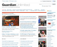
 For many years, The Guardian or Guardian Unlimited as it is called on the web, set the standard for newspaper web publishing and it is only recently, in my opinion, that other newspapers have closed that gap. However, the old design was starting to look dated and the recent redesign of the Guardian Unlimited frontpage has pushed it in front again.
The new design has not yet been applied to all pages on the website but it presents the information in a wider grid-based layout that is clear with an attractive use of images and colour scheme. This sets it apart and I'll be interested to see how the new design is applied to other pages.
2. The Times Online
 The Times Online is another excellent example of information presentation in a grid layout with an attractive colour scheme of (mainly) blue and grey hues. The overall look is more like a magazine in some ways but this makes the information, particularly on the front page, easy to scan. The layout changes between three and four columns depending on the page context. I also really like the Ajax-like tab-based navigation (Most Read, Most Commented, Most Curious) at top right. However, for me, the adverts on the Times seem more obtrusive compared to the Guardian.
Under the surface, Guardian Unlimited and the Times Online use modern CSS-based layouts which is great to see.
3. The Telegraph
The Telegraph has a more conservative 'look and feel' in my opinion but it's multi-column layout is also extremely well organised. I like the use of large font-size Verdana for the main headlines. The layout looks 'busier' than the Guardian or Times Online - which I liked at first. However, over time, I think I prefer the slightly less busy Times Online and Guardian. The Telegraph uses a tables-based layout which probably means a slightly older design than the other two. I imagine that tables will be phased out in the near future.
Conclusion
All three websites do a great job of presenting the information which is what you might expect from newspapers with many years editorial and typography experience. I read the news from all three websites but I also like to look at the design aspects. There's always something to learn.
Overall, I prefer the Guardian Unlimited and Times Online over the Telegraph - with the Guardian sneaking in front with its attractive new design/layout.

Comments are OFF for this post.