Horsham Pub Guide 2006
I wrote this post a while back. The content can still be relevant but the information I've linked to may not be available.
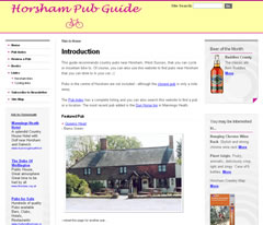
Over the last few days, we’ve been working on a new design for Horsham Pub Guide. For this project we decided to use a three column CSS stylesheet/layout.
Left: Horsham Pub Guide screenshot – the new 2006 design
We were not too familiar with three column layouts because two column fixed width layouts worked well for us in the past. Hmmm. We might need some CSS help. We also wanted to complete the new design within a few days. For these reasons, we looked for pre-existing CSS layouts and stylesheets that we could use, where (some of) the hard work has already been done. After some consideration, we used one of the excellent CSS/HTML web templates from Mollio.
After a few days, slaving over a hot keyboard, the new design (above) was launched. We like it.
Lessons learnt
- Using a CSS stylesheet template is a great way of learning new ways of doing things outside of your ‘web design comfort zone’
- Considering the structure of the webpage at the start helps the process.
- If you want to complete a new design quickly, don’t start adding new functionality to the website. Stick with existing functionality for now.
- Have a beer at the end of a long day.
The redesign in this case also emphasised the different (X)HTML/CSS code that is used today, compared with a few years ago when the previous Horsham Pub Guide website design was originated.


Comments are OFF for this post.